
Wednesday, December 13, 2017
Monday, December 11, 2017
Week 11/12 - Editing - Image 6


The editing process was similar to Image 4, as I made the background black and white but kept the models in colour. This was to draw the focus on to the models.
 I changed the colour balance of the models making the yellow tones more neutral.
Week 11/12 - Editing - Image 5
With this image, i've edited two images within one. However I haven't decided whether I'm going to use the image where I edited two image sin or just the first edited image.
Below is the original first image.

Below is the edited version.

With this edit, I followed the same steps at Image 1, 2 & 3.


I then had an idea, in making it a bit more complex. So I added in another layer of another group photo I took. In this the models were wearing different outfits as they swapped with another model.

Once I had used the magnetic lasso to create a new layer of just the models I was able to fit them in.
Taking it another step further I decided to sue the posterize effect on the background layer. I felt this added a lot of noise to the image and mirrored but took my own take on the end product of databending that we previously learnt in a workshop.

Below is the end product.

Week 11/12 - Editing - Image 4
The first image is the original image and the second is the edited version.


Once again I sued the lasso tool in order to make the background black and white but keep the model in colour.

After doing that I also adjusted the colour tones on the model just to make it more enhanced. Lastly I added an outer glow on the layer of the model.

Week 11/12 - Editing - Image 3


The editing process was the same as the other 3 images. I chose a orangey/yellow tone for the background as I felt this was more mellow and perhaps would reflect on the clothes she's wearing, as unlike the previous ones this is the most 'feminine' or 'girly'.


I decided to crop the image as I thought it made it more striking, as the models gaze was directed at the viewer.


Week 11/12 - Editing - Image 2
The 1st image is the original image and the 2nd is the edited version.


TI wanted to edit the image similar to the other one, however I wanted a different colour for the background, something with more red tones. The process of editing this image was similar to the first image. Using the magnetic lasso tool around the model to create a new layer, allowing me to change the original layers colour.


Sunday, December 10, 2017
Week 11/12 - Editing - Image 1


 I wanted to keep the image as natural as possible, however, I did not like the colour of the curtain behind. I decided to play around with the colour balance to see how that changed the image. To do this I first had to use the magnetic lasso tool and outline the models body, once I had all of her selected I copied and pasted it creating a new layer. I then selected the original layer and changed the colour balance. Having a 2nd layer of the model, meant I could change the colour of the background keeping the model the same. With each colour change, I felt it made the image have a completely different feel to it.
I decided I would use the blue tone, as I felt it gave the photo a brighter feel. I also thought the blue tied in with the models quite 'boyish' outfit would make the viewers perceive the model in a certain way. . as blue is a colour mostly associated with boys.

Finally, I selected the layer of the model and played around with the brightness and contrast to make sure the image was as crisp as it could be.
Saturday, December 9, 2017
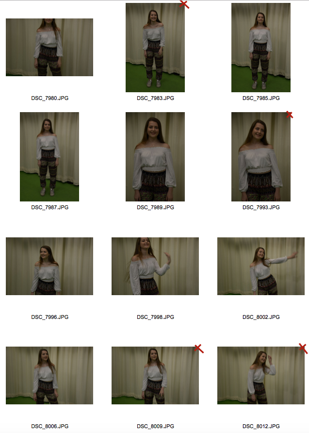
Week 11 - Final Project Photoshoot Contact Sheets
I've marked the pictures I definitely would not be using with a red x on the top right corner of the picture. I felt some of these pictures were unusable because either the lighting was not right or the model was blinking. Some of the pictures I captured had blur as I did it on a slower shutter speed + the model would be moving, I did not mark these pictures as unusable as I thought they seemed quite interesting and with the use of photoshop or even databending I might be able to produce a photo with a different meaning that I did not originally intend on.
Below are the contact sheets.


Subscribe to:
Comments (Atom)
-
This week we were taught about vernacular photography. What is vernacular Photography? It is photos of everday life and objects. One may...
-
 The 1st image is the original image and the 2nd is the edited version. TI wanted to edit the image similar to the other one, ...
